
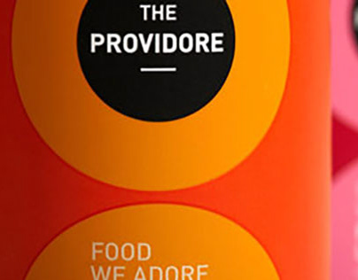
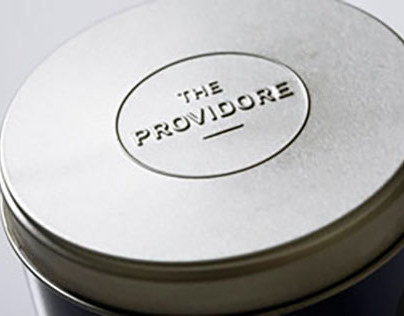
THE PROVIDORE’S EXQUISITE TEA PACKAGING

CLARKE QUAY WAYFINDING DESIGN SYSTEM
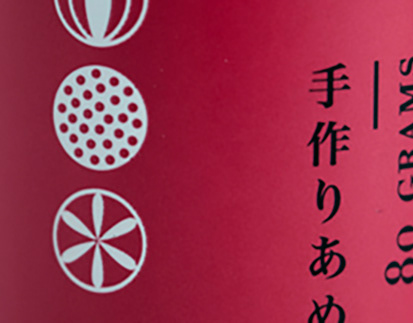
THE PROVIDORE JAPANESE HANDMADE SWEETS
THE PROVIDORE COFFEE
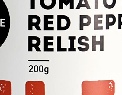
THE PROVIDORE JAM, MARMALADE, RELISH, PICKLE & CHUTNEY

LUKA I ITALIAN – DINING/PIZZA/BAR_
THE PROVIDORE EXTRA VIRGIN OLIVE OIL

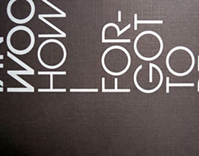
UPPEROOM

KUSHI KUSHI
BLUE BEETLE DESIGN

LITTLE BEGINNINGS PRE-SCHOOL
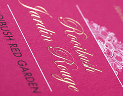
THE MIRACLE COLLECTIONS

A VOYAGER’S DIARY TEA
THE PROVIDORE EXQUISITE CHOCOLATES

IBN CORPORATE BROCHURE

ETPL RIE 2015 MIDTERM REPORT
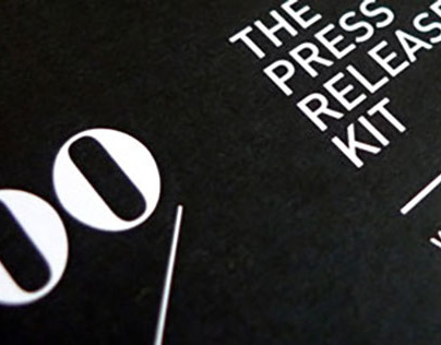
THE PROVIDORE PRESS RELEASE KIT
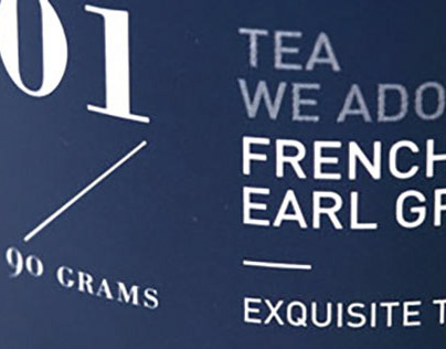
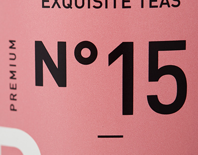
THE PROVIDORE EXQUISITE TEAS
THE PROVIDORE PREMIUM CORDIAL
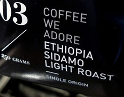
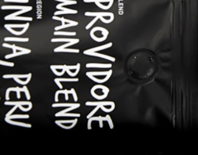
THE PROVIDORE COFFEE
TOMIO KOYAMA GALLERY EXHIBITION CATALOGUE

P5 AD SERIES 5.0

VICCAL
BETJEMAN & BARTON TEA
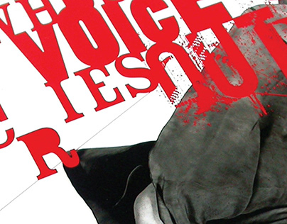
WHOSE VOICE CRIES OUT?
THE PROVIDORE ORGANIC SPARKLING JUICE
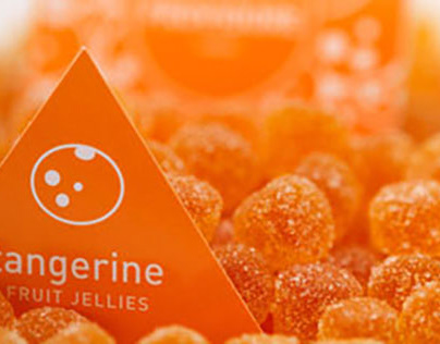
THE PROVIDORE LOLLIES
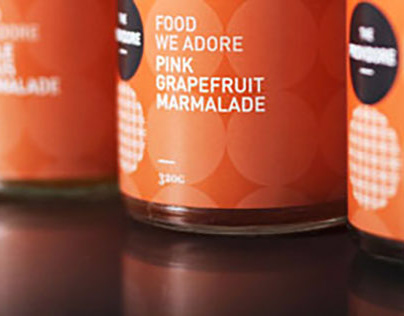
THE PROVIDORE JAM, MARMALADE & SAUCE
THE PROVIDORE DRINKING CHOCOLATES
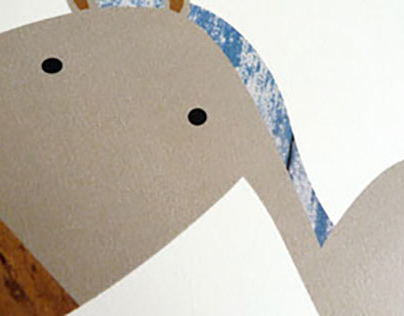
BBD CNY CARD – HORSE

COLLECTIVE DESIGNS
MUDIAN

CLOTHESMITH

IBN ANNUAL REPORT 2005

BBD CNY CARD – SNAKE

METTA CONVENTION
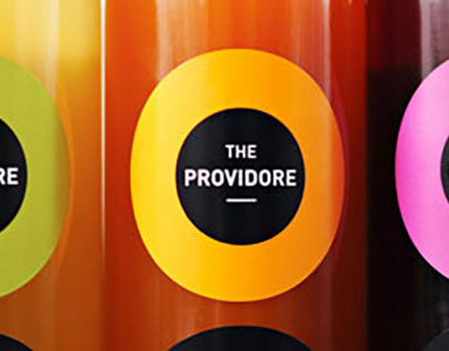
THE PROVIDORE

BUGIS+

TWINKLE
AWARENESS PLACE

SIMPLY FLOWERS